03 /
Stade Toulousain
Stade Toulousain
A club with status,
an identity that needed to try harder.
Stade Toulousain already had the history and status. The identity needed the clarity and force to match. The useful answer was not complexity, but a bolder mark that could keep working everywhere. As always, the real test was whether the identity could hold together convincingly across real communications and real audiences.
← Back to work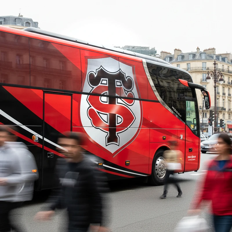
SituationA major sports club whose emblem needed to match its stature
and visibility.
RoleIdentity redesign and application.
What matteredA simple, durable monogram-led identity suited to wide
public use.
The useful diagnosis.
What they asked for
Strengthen the club identity.
What we found
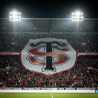
The communications context had expanded. The emblem needed to work harder, more often, and in more places.
What we recommended
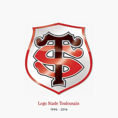
Build a clearer, more robust mark capable of carrying status without decorative excess.
The strongest marks tend to say less, not more.