05 / Arbeau
A clearer view of the range and a stronger
impression of the
producer.
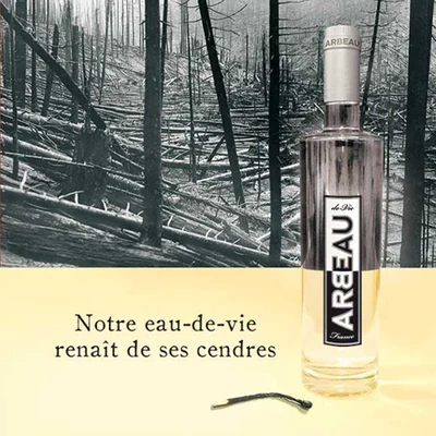
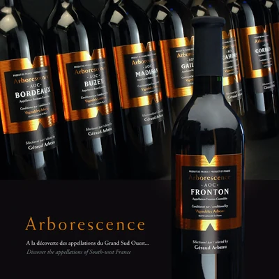
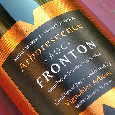
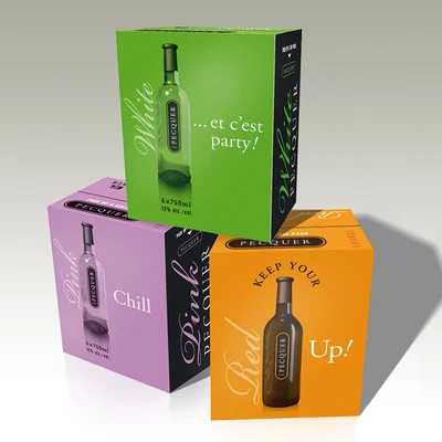
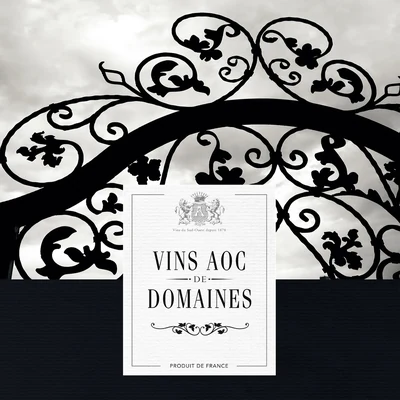
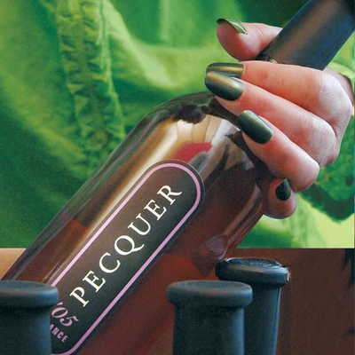
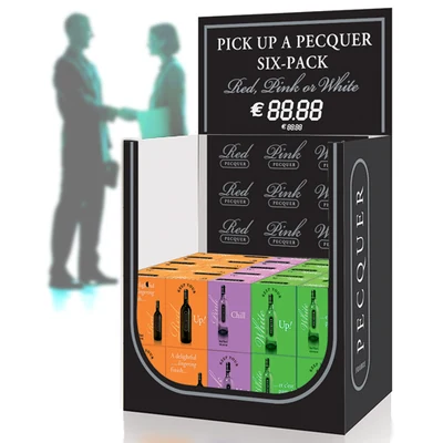
Arbeau’s work centred on helping a varied wine offer read more clearly. The task was not simply to make labels look nice, but to help the range organise itself in the customer’s mind. That meant making the proposition feel more precise and more credible without losing the warmth of the people behind it.
← Back to work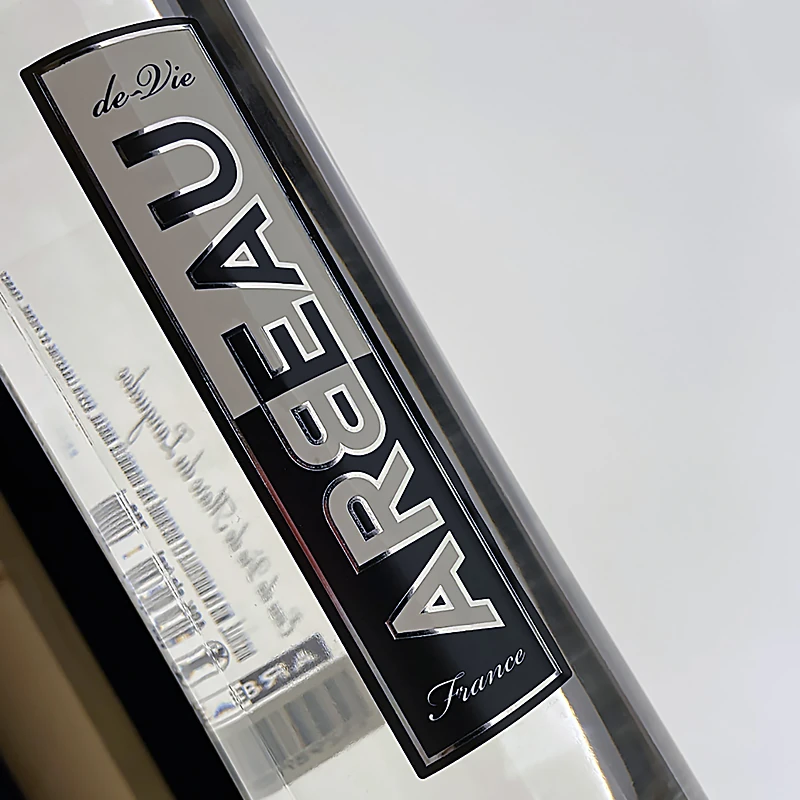
SituationA wine range that needed clearer hierarchy and easier
understanding.
RolePackaging, hierarchy and brand presentation.
What matteredA more legible and coherent offer, with individual
products still able to stand on their own.
The useful diagnosis.
What they asked for
Improve the presentation of a growing range.
What we found
The issue was not a lack of design, but a lack of immediate understanding across the offer.
What we recommended
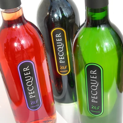
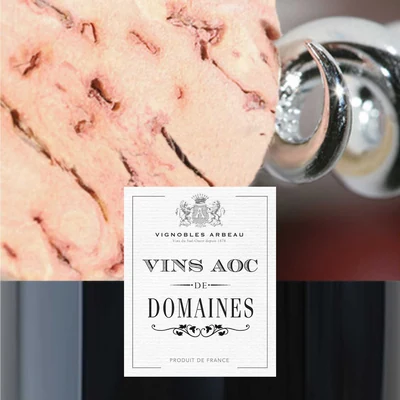
Create a stronger family logic while keeping enough distinction to support choice and character.
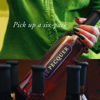
People decide faster when the offer explains itself.